“We need to make our brand feel human. It needs to reflect our people and our customers. We need to tell a human, emotive story.”
This is how a lot of our conversations about brand design begin. If we were designing for packaged goods that sit on a shelf and give people a tangible representation of your brand, we’d have a well defined experience to address. But most of our work takes place behind the scenes in the B2B and tech space. There are no shelves or stores mediating the process, no physical objects or packaging. There’s sparse or no direct interaction with the end-user. And the technology itself is invisible which increases the challenge of crafting a bespoke visual identity that evokes emotion.
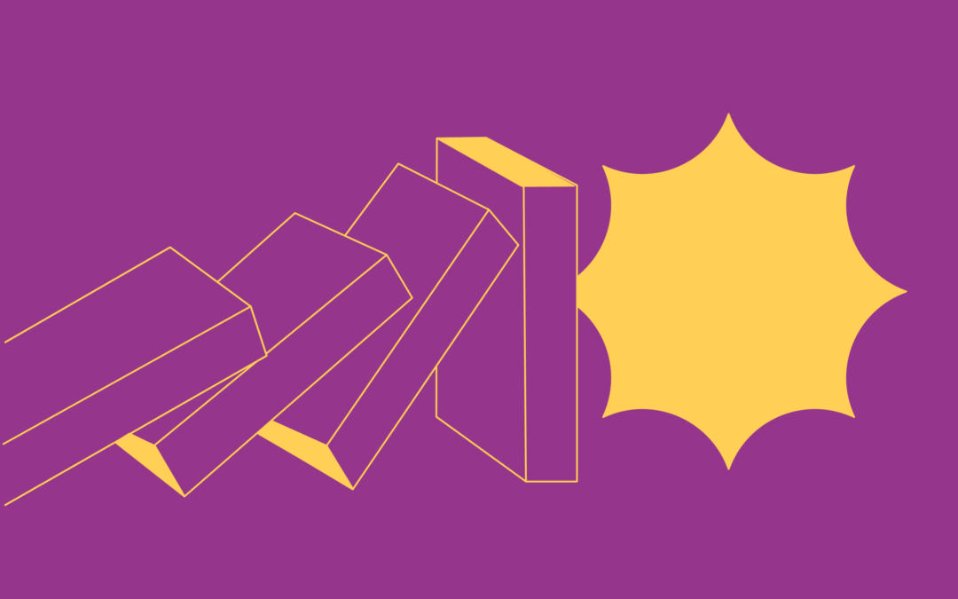
Curating a distinct visual style is table stakes when developing design systems. But we’ve seen that in B2B branding, sometimes the smaller, more nuanced design moves can transform a smart visual identity design into a deeply evocative brand that evokes just the right feelings. Because these design moves don’t hit people over the head, they may not fully register at first glance, but over time, they shape the response people have to a brand.
A sense of (e)motion
Motion elevates the game. While static logos aren’t going away, just about every brand needs to move in some way, shape or form—whether it’s a dynamic logo or a kinetic design system that pushes the limits. And it’s often the little moments that spark delight—the sudden blink of a circle, the anthropomorphic smile in a lowercase ‘e’, or a subtle twinkle of light to punctuate a moment in the story. It’s these moments that draw people deeper into the brand story in the same way that physical packaging might speak directly to a consumer with an elegant serif font or bespoke illustration.
Our recent work to rebrand Katapult—an AI platform behind the e-commerce scenes that gives customers a fair way to pay for their purchases online—was an opportunity for our team to bring all the heart, feeling and optimism of the customer to the forefront of the brand. Sure, the photography needed to capture the heart and goodness underlying the brand, but we had to go deeper. So we used their name as our launching-off point, or catapult, if you will. Rather than trying to force all of our storytelling into a logo symbol, we crafted a wordmark that evokes the feeling of the human hand signing for a bill of goods. That calligraphic sense of motion led our team to develop something more emotive than just a symbol—a brand feeling of being uplifted and elevated. This feeling—which came to be known as “The Bounce”—comes through at every turn, from the upward curve that literally bounces off screen, guides storytelling in infographics, or connects images, words and ideas together. Ultimately, “The Bounce” became more than a visual component—it became a deeply felt personality trait of the brand—and something the client could really get behind as an emotive representative of the brand, something much greater than a traditional logo symbol.
Sonic branding
Just like the barrage of visuals that we experience every day, our world is filled with sounds (a lot of it noise). In addition to motion, sound has a similar capacity to evoke feelings and brings another dimension to what a brand—and more specifically, a logo—can do. Sonic branding adds a richness to the brand experience, often creating a more bespoke and lasting imprint on how you experience (and recall) a brand. The Disney+ logo that introduces their content is a good example of a small moment that adds a big feel to how you interact with their identity. Now, it may be that I’ve seen/heard their identity more times than I care to count while watching with my 7-year old, but there’s no denying how seeing AND hearing that magical beam of light swoop over the wordmark makes a deeper impression. It puts viewers into a state of curiosity and preparation for what’s about to come on screen. The ability to generate that lean-in feeling is a mark of a truly successful logo experience.
Our recent rebrand project for Pindrop included a sonic dimension to the brand. Because Pindrop is a pioneer in the voice technology space, creating a sonic brand was a strategic imperative. It was exciting to work with our partners at MusicVergnuegen to craft an audio component that brought Pindrop’s invisible, future-forward technology to life with a sound of a safe unlocking. Similar to Disney+, it’s hard not to smile when their logo symbol transforms and resolves on an audio crescendo. It’s the little things that often make the most impact.
Design needs to solve problems and deliver on the goals of the client but also has the great potential to unlock new ways of seeing, hearing and experiencing a brand. See (and hear) more of our work here and let us know if we can partner together to help solve your branding challenges.


