The Myth of Likability and Other Lessons from Font
Last month, we were visited by the good folks at Dalton Maag, an independent font foundry with offices in London and São Paulo, Brazil. They make type for branding, retail, and corporate clients that perform beautifully across print and digital environments.
After running us through some of their work, including an amazing demonstration of variable fonts – responsive type that can store multiple variations of a type family into a single font file – we got into a discussion on the differences between three components of evaluating type: legibility, readability, and likability. And what we discovered illuminated a new way to approach creative decision-making in general.
Legibility
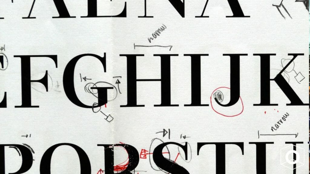
First off, the legibility of a typeface is a product of its design and relates to the ability to distinguish one glyph from another when reading. Factors contributing to a typeface’s legibility include the following:
- X-height – The height of the lowercase in proportion to the caps. Traditionally, the taller the x-height, the more legible the typeface tends to be.
- Character width – The easiest type designs to read are those that have an “average” overall width. Very condensed or extended designs are less legible, especially for smaller settings such as text, subheads, and credits.
- Weight – Extremely light or heavy weights are more difficult to read, so if legibility is your goal, stick to something in the middle.
- Design traits – The overall shapes and design traits of a typeface. If too quirky or fussy, it will reduce legibility.
- Stroke contrast – The ration of thick to thin strokes.
- Counters – Enclosed or semi-enclosed negative shapes.
- Serifs, or lack thereof – While serifs are generally believed to enhance legibility, this is not always the case, as we’ll discuss later.
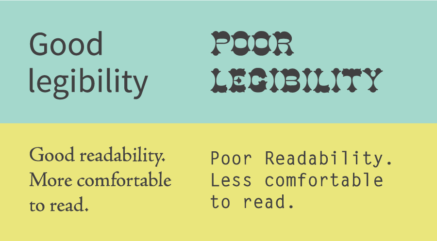
Readability
Readability, on the other hand, is related to how the type is arranged, or typeset, and therefore is controlled by the designer. The factors affecting type’s readability are more familiar to the average reader: type size, type case, line spacing, line length, color, and contrast.
For those outside the design world like myself, having a language and measuring system for evaluating type was an epiphany. Something that I assumed was completely subjective had an entire mathematical rubric behind it. If I could learn to see like a type designer, maybe I could change the way I make decisions.
Likability
So when we got to the topic of likability, based on the above information, I naturally assumed we would be crunching the numbers to land on the objectively best font.
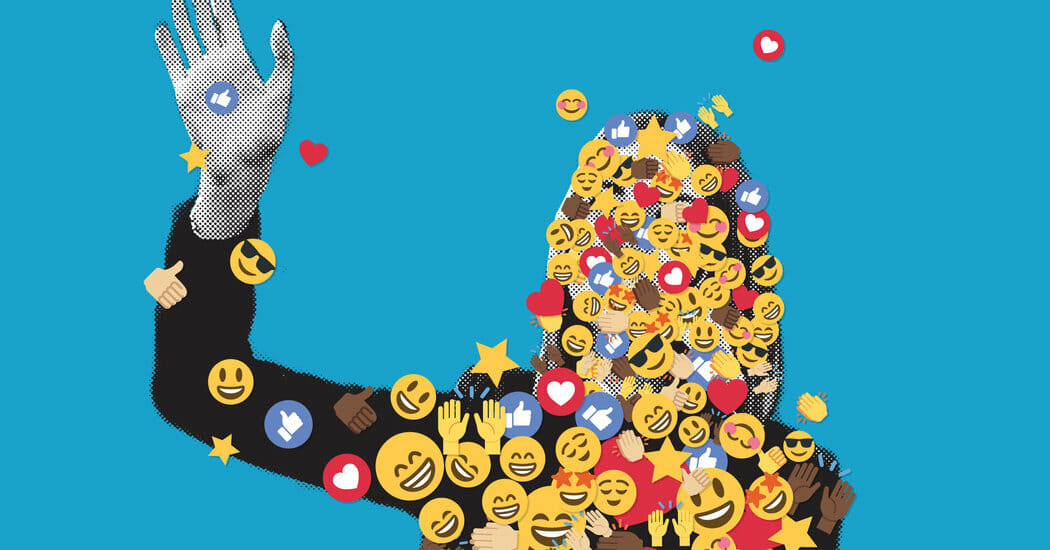
In running a test for accessibility, Arial 14-point is actually not as accessible as some other fonts, explained Eleni Beveratou, Creative Director at Dalton Maag. Yet because Arial 14 point is what the test group was used to read in their daily life, they actually rated it as more likable and perceived it as more legible. In the end, the biggest contributing factor to likability is simply what you’re most familiar with.
“The likeability of a typeface has a major impact on whether someone will engage with a piece of content or not, despite research proving some typefaces more legible than others,” continued Eleni. “It is important to create inclusive and accessible reading experiences for all, regardless of reading ability or visual acuity. Inclusive isn’t synonymous with boring or monotonous; many typefaces can be inclusive while maintaining a distinct and fresh expression. This is the challenge that we need to embrace.”
In other words, what you read most, you read best. Despite all of the research, despite all of the proof points, despite our supposed obsession with trailblazers and disruptors, people tend to like what they’ve seen before.
Untrain Your Likability Reflex
Perhaps that seems obvious, but it’s a subtle sea change in how we should approach decision-making. Think back to your last team meeting, pitch, or even lunch order. How often when you say, “I like that” are you actually saying, “I’ve seen that before”? How often, when you reject an idea, are you rejecting its actual content vs. the implied fear of change?
For a minute, let’s briefly wander into the minefield of American politics. Think about how the word likability is used. Who gets to be likable? Who invented it? Whose intelligence gets to be described as inspiring and whose is off-putting, cold, inauthentic?
High-achieving women, sociologist Marianne Cooper wrote in a 2013 Harvard Business Review article, are judged differently than men because “their very success – and specifically, the behaviors that created that success – violates our expectations about how women are supposed to behave.” When women act competitively or assertively, rather than warm and nurturing, Cooper writes, they “elicit pushback from others for being insufficiently feminine and too masculine.” As a society, she says, “we are deeply uncomfortable with powerful women. In fact, we don’t often really like them.”
The Curse of Familiarity
In design, politics, and life in general, we are all vulnerable to our own biases. For those in charge of a brand, their job is often to maintain an image. Familiarity is a gift! It’s the easiest way to get approval with the least amount of friction and risk. But the curse of familiarity is stagnation. If you’re only ever making decisions based on what you like, you’ll never grow.
Remember the cycle of Facebook redesigns in the 2000s? Each new aspect – the Mini-Feed, poking, the Graffiti Wall, Open Graph, Newsfeed, Timeline – spurred dozens of petition groups with thousands of members demanding its removal. And then when they did? You guessed it: dozens of petition groups with thousands of members demanding its reinstatement. As satirized in the comedy series Jake and Amir, “Garbage becomes perfect over time as you get used to the garbage and forget what made it so bad. Like, you don’t get the internet.”
Change Is Hard
Reading the world, just like font, requires a set of criteria beyond likability. Familiarity is a detriment to making ground-breaking work. Next time you’re evaluating creative or presented with an opportunity for change, don’t be afraid to embrace the unknown. It might just become your new favorite type.
Emotive Brand is a brand strategy and design agency in Oakland, California.