In the nascent days of computing, the highly sought after feature we now call “dark mode” was the standard. Cathode ray tube (CRT) monitors got their green-on-black look from the phosphor inside of the screens. While this technology was long-ago abandoned, dark themes have re-entered the zeitgeist as the latest “new innovation.”
“It’s thoughtfully designed to make every element on the screen easier on your eyes,” Apple claimed in its announcement of the feature for iOS 13. But here’s the thing: there’s no real evidence that’s true. For people with astigmatisms (approximately 50% of the population), dark mode is worse on the eyes.
As Gizmodo reported in 2014, citing research by the Sensory Perception and Interaction Research Group, at University of British Columbia, white backgrounds act as a “crutch” for astigmatic eyes:
People with astigmatism find it harder to read white text on black than black text on white. Part of this has to do with light levels: with a bright display (white background) the iris closes a bit more, decreasing the effect of the “deformed” lens; with a dark display (black background) the iris opens to receive more light and the deformation of the lens creates a much fuzzier focus at the eye.
Follow the Leader Is a Losing Game
While there isn’t concrete evidence of the benefits of dark mode, at the end of the day, Apple is a tastemaker and hundreds of companies will now see this as a design imperative. The question then becomes: instead of playing follow the leader, how can brands leverage design to make themselves accessible to the most people possible?
“When we think about accessibility design, dark mode is a recent example of behavior change only coming as a result of following others, as opposed to being the one to take those risks,” says Senior Designer Jonathan Haggard. “Software and accessibility can influence brand in a great way, instead of being an afterthought.”
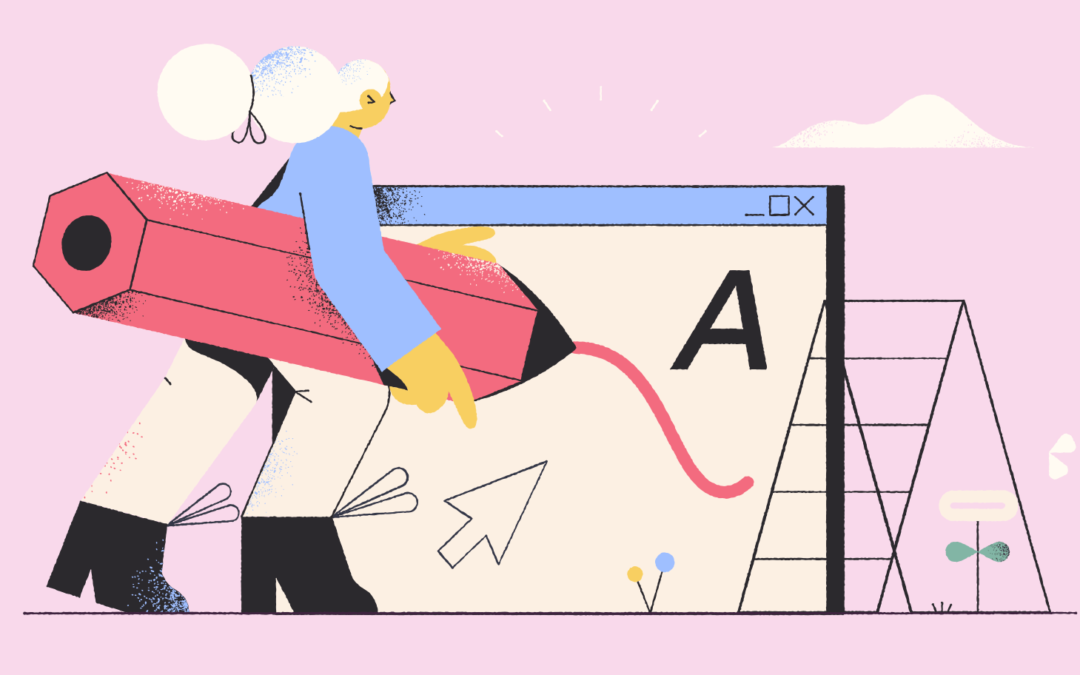
It starts with an acknowledgment that if you want to create something truly groundbreaking, there is no such thing as “a given.” It requires pausing to question those knee-jerk decisions you make without really thinking, like, “Oh, I’m building a website. First step: white page.” After all, when Tesla designed their car, they didn’t start with a gas engine.
It Ain’t Easy Being Pink
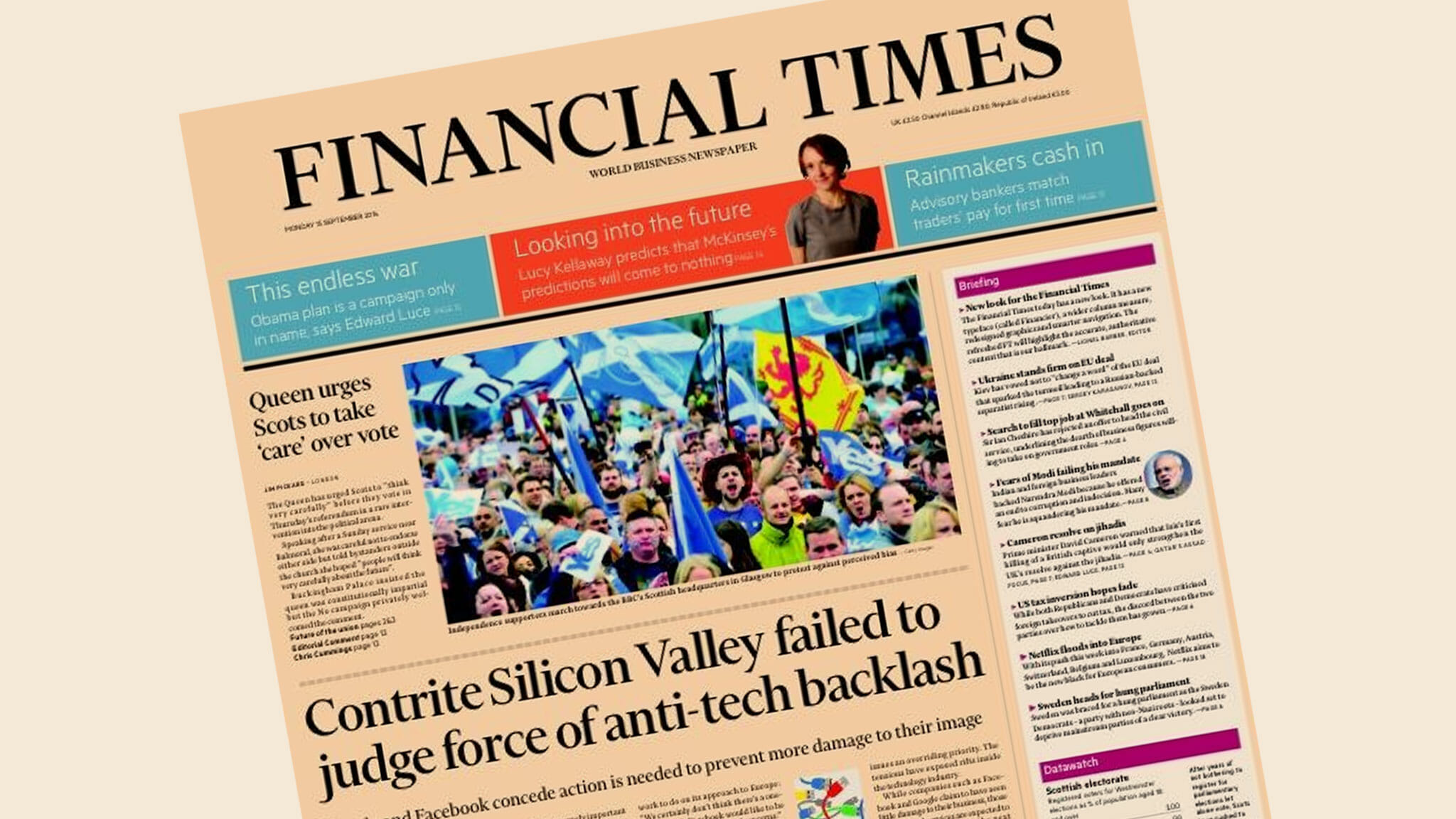
Take the Financial Times, for example. Instead of volleying back and forth between white or black modes as others have done for the last 35 years, they are unabashedly pink. As a design choice, it’s a risk. But it’s one that immediately differentiates them, increases the contrast, and may provide better readability over longer sessions, especially at night. They could have just stuck with white like everyone else, or followed-suit with Apple, but they have stuck to their guns.
Walk the Walk with Your Design
For another take on accessibility, consider Low-tech Magazine, a solar-powered, self-hosted website that has been designed to radically reduce the energy use associated with accessing content online.
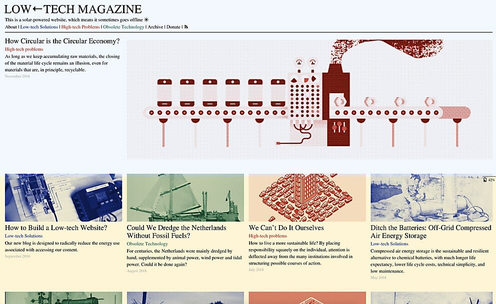
They opted for a back-to-basics web design, using a static site instead of a database-driven content management system. They apply default typefaces, dithered images, off-line reading options, and other tricks to lower energy use far below that of the average website. Because it uses so little energy, this website can be run on a mini-computer with the processing power of a mobile phone. In addition, the low resource requirements and open design help to keep the blog accessible for visitors with older computers and/or less reliable internet connections.
Countless brands tout the importance of accessibility and sustainability, but how many are actually walking the walk with their design choices?
Accesible Design Has Unexpected Positive Upsides
As we learned in our work with Alluma, a tech nonprofit whose solutions help people enroll in public benefits programs, designing for accessibility lends itself to unique executions. People tend to think about the word “disability” as a separate, static category, but it’s much more fluid than that. In taking the steps to make your website accessible, you will be helping everyone on the spectrum—from those with slight preferences to those with severe barriers.
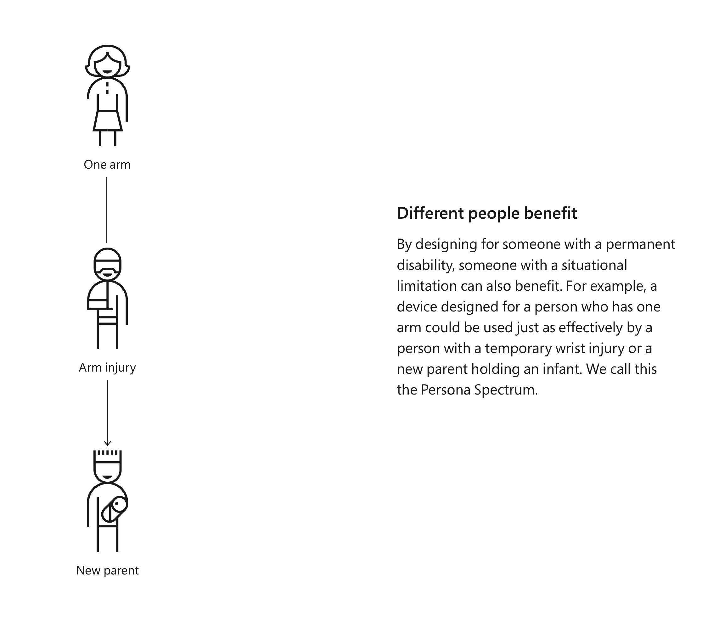
“When you design for the ‘worst-case scenario,’ oftentimes people who are suffering in similar but less intense ways can benefit, too,” says Jonathan Haggard.
Accessible design will always save you time in the long run. It’s worth remembering that you and your customers are not fixed in space. Their preferences, abilities, and circumstances will change over time. Why not plan for those contingencies now?
Emotive Brand is a brand strategy and design agency in Oakland, California.


Amazing blog. Unogeeks is the top Oracle Fusion Financials Training Institute, which provides the best Oracle Fusion Financials Training