A Deep Dive into Designing for Accessibility
Today’s blog is about our recent work with the Galt Foundation, an organization that provides, promotes, and expands employment opportunities for individuals with disabilities. You can view our full case study here. The following post is available as both a text and audio experience.
Designing for Accessibility Is a Duty, Not an Option
As designers, we have the opportunity to create experiences that bring people together, but we also have a responsibility to create work which can be experienced by everyone, regardless of ability. That’s not to say that everyone will perceive or appreciate the work in the same way, but it remains our duty as designers to provide certain baseline aesthetics which allow for everyone to understand the information.
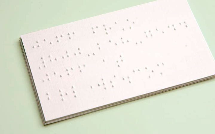
Most people agree with that sentiment, but perhaps it lives more in the hearts and minds of designers than in the actual finished products we see in the world. For instance, how many smart tablets or watches with braille have you seen or felt lately? The technology is there, but the widespread implementation is not.
Good design should resonate with the end-user on an intellectual and emotional level, and most importantly, it should champion inclusivity. Inside jokes have their place, but when it comes to communicating a brand promise or conveying important messaging, clarity and accessibility should reign supreme.
Can Design Be Accessible and Still Be Beautiful?
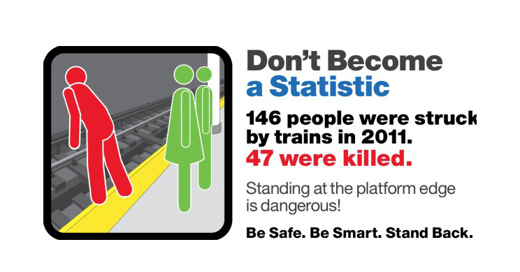
There is a misconception that, by nature, designing for optimal accessibility will result in work that is less sophisticated or visually engaging. If you’re like me, you’ve spent a good part of many commutes on the train silently critiquing the PSA poster designs.
Having recently created a new brand identity with strict accessibility parameters, I can attest to the fact that while it might be more challenging and require a deeper strategic approach, it is more than possible to embrace accessibility while still crafting beautiful and dynamic work.
When it comes to designing with disability in mind, architects and industrial designers have been ahead of the curve for decades. Buildings are outfitted with wheelchair access. Phones are designed for people with hearing impairments. In fact, SMS texting was originally developed for the deaf, but when texting dramatically saved telecom bandwidth, the world of cellular telecommunications changed.
The question with which I was concerned over the last year was how does this design mentality translate into designing an entire brand experience – from a logo and tactile stationery, to a digital experience on a website and mobile phone?
Finding Opportunity in Constraints
“Can we make the type bigger?” Many designers have heard this feedback at one time or another. The last thing a designer wants is to compromise their artistic vision – especially if the request doesn’t stem from a strategic design point of view – but designing for inclusivity can actually force open new windows of creative opportunity. Accessible design doesn’t need to mean safe, boring, or pedestrian. In fact, it might just allow the design to develop into something even better. As with any client, everything begins with understanding the problems that need to be solved, both from a strategy and design perspective.
1. The Who, What, and Why?
The Galt Foundation is an Oregon-based non-profit professional staffing service that places people with disabilities in temporary government jobs. They had a successful business model but wanted to expand across the U.S. while launching entry into the private sector.
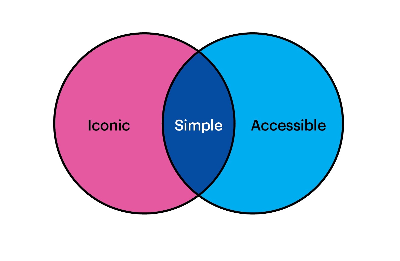
The challenge was to create a brand platform that would allow them to tell their story to both private and public sector clients, as well as prospective employees. They needed a visual identity that could resonate with employees of the Facebooks and Googles of the world, as well as government institutions. One that could sit alongside iconic, mission-driven brands like Planned Parenthood and Conservation International, yet still be fully inclusive of people with disabilities. In my mind, the common thread that bridged this gap was purposeful, well-crafted simplicity.
2. Design Criteria
First of all, we needed to clearly define what is and what is not “accessible” as it pertains to the project. Understanding the parameters of what was considered a disability in the context of this project helped set my team’s and client’s expectations, and allowed me to see how much we could push its design.
In the application of the brand, it was also important to know the differences between digital and non-digital accessibility. A key design deliverable for this project was redesigning the company website in compliance with the Web Content Accessibility Guidelines (WCAG) – a robust, continually evolving guideline of referenceable technical standards with testable success criteria. I quickly understood the limitations we faced with the online experience: strict rules for type-size minimums, visual cues for navigation, and essentially removing any motion effects, iconography, and a host of other potential graphic devices.
3. Know the Rules
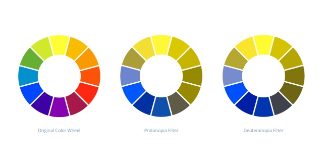
When accessibility is a design criterion, you need to know how to evaluate your work properly, rather than designing in a vacuum. In the case of Galt, in order for me to create an accessible color palette, I needed to understand how the work would ultimately look to people with vision impairment. Specifically, varying types of color blindness, as color blindness affects approximately 1 in 12 men and 1 in 200 women in the world.
There are many online tools for evaluating digital color. For example, Color Oracle applies a filter to your monitor to simulate how things look to someone with color blindness. Using it, you truly realize the implications of vision impairment within the context of “surfing the web.” It was clear that color could not be used as the only visual tool for conveying information, prompting a response/action, nor distinguishing a visual element.
4. Audit, Audit, Audit
A comprehensive audit and immersion help me to not only understand where the client currently is from a design perspective but also to understand the target audience and competitors. What are the best (and worst) practices out there? This information plays a crucial role in how I determine the specific areas of opportunity for the creative approach, and how design can help differentiate the client in their space.
Sometimes, as was the case with Galt, the insights gathered from the audit, combined with our accessibility criterion, actually created new design obstacles that needed to be overcome. For example, the necessity of a color blind-appropriate palette pushed us towards the blue spectrum, yet our audit of competitor brands revealed heavy use of blue. Ultimately, the totality of this information led us to strategically and empathically differentiate Galt with a proprietary green.
5. Get to Work
Exploration, ideation, rinse and repeat; that’s the usual routine for a designer. However, I found that in addition to the usual rigor of my creative process, empathy needed to take a front seat at our internal design reviews. At every step of the way, I asked a series of questions: would this be confusing to someone with a hearing or vision impairment? Can this be even clearer and more accessible? Is this language too esoteric? Are certain design elements here just for show, or do they add relevance to the story?
A key lesson I learned from this process was to remain perpetually open to questions about what is possible, rather than solely focusing on standard processes. New ideas will constantly present themselves, but you need to be listening. Design thinking and design aesthetics can, and should, live together. Ultimately, it’s a matter of shifting our mindset to employ more strategic, empathic, and inclusive design thinking without compromising our creativity and sophistication. When design can solve for accessibility and still maintain a level of elegance and beauty, it’s a win-win for everyone.
Can a Logo be Simple, Accessible, and Still Tell a Complex, Meaningful Story?
The answer is a resounding yes. Designing for accessibility first, then pushing design within those parameters is not the norm, but can result in ideas that are more unique and often better than the standard. Designing for accessibility only tightens the guardrails, forcing the designer to elevate the entire process to tell a compelling story. You’ll find that your creativity is challenged to use more grounded design thinking to solve a problem, rather than trying to throw visual tricks or effects at a problem.
Before starting a project, I always used to ask, “How can I best tell this story?” After working on Galt, I might rephrase that as, “How can I best tell this story for as many people as possible?” Remember, we aren’t designing for design’s sake – we are designing for everyone.
Emotive Brand is a brand strategy and design agency in San Francisco.