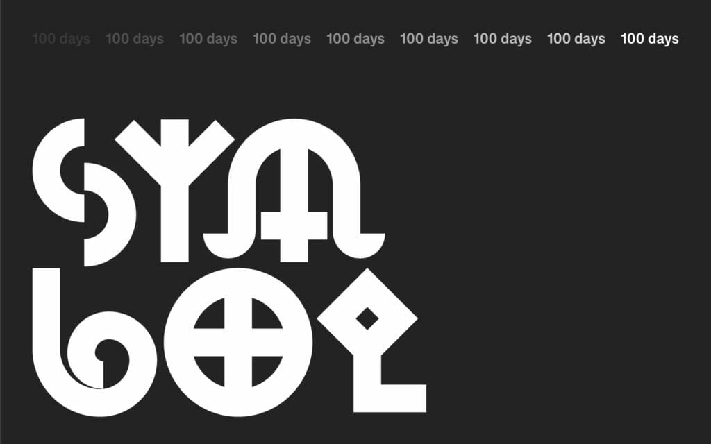
#100DayProject: From Ancient Symbols to Brand Design
This year, the design team at Emotive Brand is participating in the #100DayProject. Today, we sit down with Senior Designer Jonathan Haggard to discuss symbols, simplicity, and how to be brave in your creative decision-making.
What is the #100DayProject?
The 100DayProject is a free art project started by Lindsay Thomson that takes place online. Every spring, thousands of people all around the world commit to 100 days of exploring their creativity. The idea is that you pick a theme or a project and rev on that 100 times. This year, our focus is on how ancient symbols inform contemporary brand design.
In the beginning, you tend to go for the most obvious choices, but by day 19, you find yourself really having to flex your creativity. It forces you to think from different perspectives and be thoughtful about your approach to rendering something in a unique way.
https://www.instagram.com/p/Bw294x1FRh-/
How did the team land on symbols?
We threw around a couple of ideas, but something about exploring symbols seemed to capture everyone’s imagination early on. Three or four years ago, I created a site called the State of Symbols, which is a designer-friendly repository for symbols. #100DayProject is a great way to build off that work and the fact that there are so many symbols with thousands of years of history fits the 100-day format nicely.
https://www.instagram.com/p/BwvO_m7FI66/
What excites you most about this project?
I think my favorite aspect is being able to research each symbol and the creative process of meditating on how to render it in a new way. With the State of Symbols, I was mainly recreating existing symbols. This project is much more about breathing new life into these ancient shapes and allowing yourself the time to reflect on the core idea in an illustrative way. That requires learning the history, what it means, and seeding it in your mind as a concrete thing.
Designer Keyoni Scott is helping create the animations, and he described the process “almost like doing crosswords or those daily mind games. It’s a good way to keep the creative mind sharp and fun to just create something daily. Nine times out of ten, I learn something that I didn’t know before and I think that’s amazing.”
https://www.instagram.com/p/BwaTqzVBdVj/
What reference materials are you using in your research?
We’ve been using “Shepherd’s Glossary of Graphic Signs and Symbols,” which is an amazing collection of everything from punctuation to railway iconography to maritime navigation symbols. Also, Carl G. Liungman’s “Dictionary of Symbols” and I. J. Gelb’s “A Study of Writing.”
To me, there’s something about these print collections that are a little more legitimate than wandering for images online. You can find interesting things online, but it can be hard to tell if the person is just making stuff up without the original source. As Design Director Robert Saywitz said, “Projects like these allow you to explore different mediums beyond just the computer and brings inspiration to the forefront rather than waiting for it to arrive.”
https://www.instagram.com/p/Bv-CgR-FBvI/
What have you learned from the process thus far?
For one, just how many Venus stars there are. From far east Chinese symbols all the way to the Celtic, thousands of people throughout history have been looking at this planet and rendering it in different ways. Whether it’s a five-pointed or eight-pointed star, there’s something kind of beautiful about everyone drawing inspiration from the same thing.
Another thing is how symbols change over time. We tend to think about meaning being fixed, but certain figures like the pentagram have changed meaning roughly every 1000 years – from the morning and evening star in Palestine to the contemporary Wiccan symbol for the elements and spirit.
Lastly, the pace of the project is a challenge of its own. It needs to go out every single day whether it’s perfect or not, which forces me to be brave about decision making. Sometimes, that means bringing something to life through simplicity. For instance, the North African Berber tribe symbol for “bird” is built out five simple squares, but through the use of animation, it suddenly looks like it’s in flight.
https://www.instagram.com/p/BwDa19Eh7ZC/
What lessons can you apply to your design practice and the work we do for brands?
People have been trying to communicate the same ideas for 40,000 years. At its heart, symbols display concepts – and that’s what we do as a brand studio. We get the core concept of a company, distill it down to a simple form – the simpler the better – and we bridge the gap between a visual symbol and a series of beliefs, values, or products. As Senior Designer Beth Abrahamson said, “Symbols and their histories are inherently tied to branding, as most logos are variations of symbols that have been around for centuries and have been reinterpreted many times. Symbols are part of our vocabulary as designers and it’s super important to know where the primary forms come from and what they mean.”
Oftentimes, a company’s symbol has grown so strong that it creates a life of its own and can be simplified down to a basic geometric shape. Look at Google: the open circle form makes this shape accepting, something that has an inward motion that is exaggerated with the horizontal rule created to the right. Regardless of color, scale, or representation, it communicates the friendly nature that Google has come to embody.
Whenever I’m starting a new identity or branding project, I always try to see if there’s anything that communicates the message through the symbol itself. Sometimes, I’ll bring a symbol into Illustrator and start taking it down to its components. It’s critical to do that kind of research, because you don’t want to pick a symbol that’s highly offensive in a certain culture, or references something that’s counter to a company’s mission. Designers have a responsibility to know their history, produce great work, and keep these symbols alive.
Emotive Brand is a brand strategy and design agency in Oakland, California.