From 2007 until very recently, the web was infiltrated by the same design patterns. Everyone is familiar with this: a generic headline with a call to action, three icons below describing features, and a few full-width, black-tinted images with text on top.
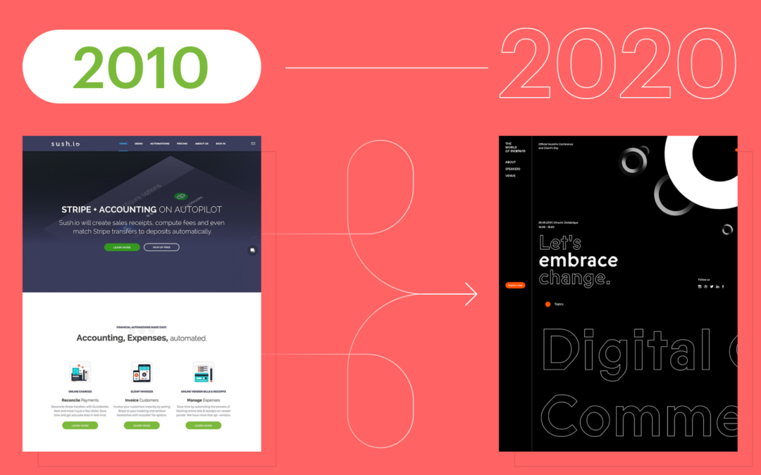
When Sketch burst onto the scene in 2010, the web design discipline sped up, but the developer hand-off process was still tedious. Dimensions were specified using redlines, and the web was built with block and inline elements. Flash was dying, and there were no tools for designers to easily bring their more expressive designs to life. Mobile browsers were, for the first time, making a huge dent in the web’s traffic and the current desktop designs were failing.
Between 2007 and 2010, dominant patterns emerged and were swiftly distributed across the web, otherwise known as Web 2.0. Sites were designed as “mobile-first,” and the same design needed to grow to desktop. The result? A simplification of UI, a flattening of design expression, and designs that were nearly indistinguishable from each other.
Web Two Dot Oh No
In the same way that designers weren’t yet educated in development practices, developers were often blind to design decisions. Due to the time spent learning Web 2.0 development practices, developers would take redlines and build them to spec with little improvement on the design. In the early 2010s when web design patterns were so new, designers weren’t comfortable pushing the boundaries. It was impossible to find rules to break while still creating a successful design on multiple platforms.
Developers started building tools to educate designers on how they could use their new playground. Prototyping and animation toolsets started appearing, like Principle, Framer, and Invision, which gave designers tools to bring their work to life through animation and interaction. On the dev side, new technologies like flexbox, CSS transitions, Lottie, and most recently canvas libraries like three.js and p5.js gave developers tools to seamlessly bring those animated designs to fruition—instead of hacking designs together with jQuery. Additionally, tools like Zeplin sped up the transition between design and development, allowing both departments more time for creative expression.
As the crossover between design and development increased, the line between the two disciplines blurred and a design resurgence occurred. A new generation of designers emerged that were comfortable designing for the web with these new tools from day one. Graphic design became a key component to what was previously specified as interaction design, as designers could be more experimental with elements like layout, typography, and color. Web tutorials and resources like codepen.io, CSS-tricks, and DevTips let designers in on the new tech that was being developed for the web and how they could employ it in their designs.
Welcome to the New Web
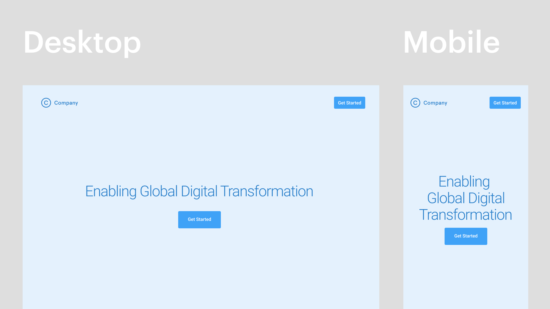
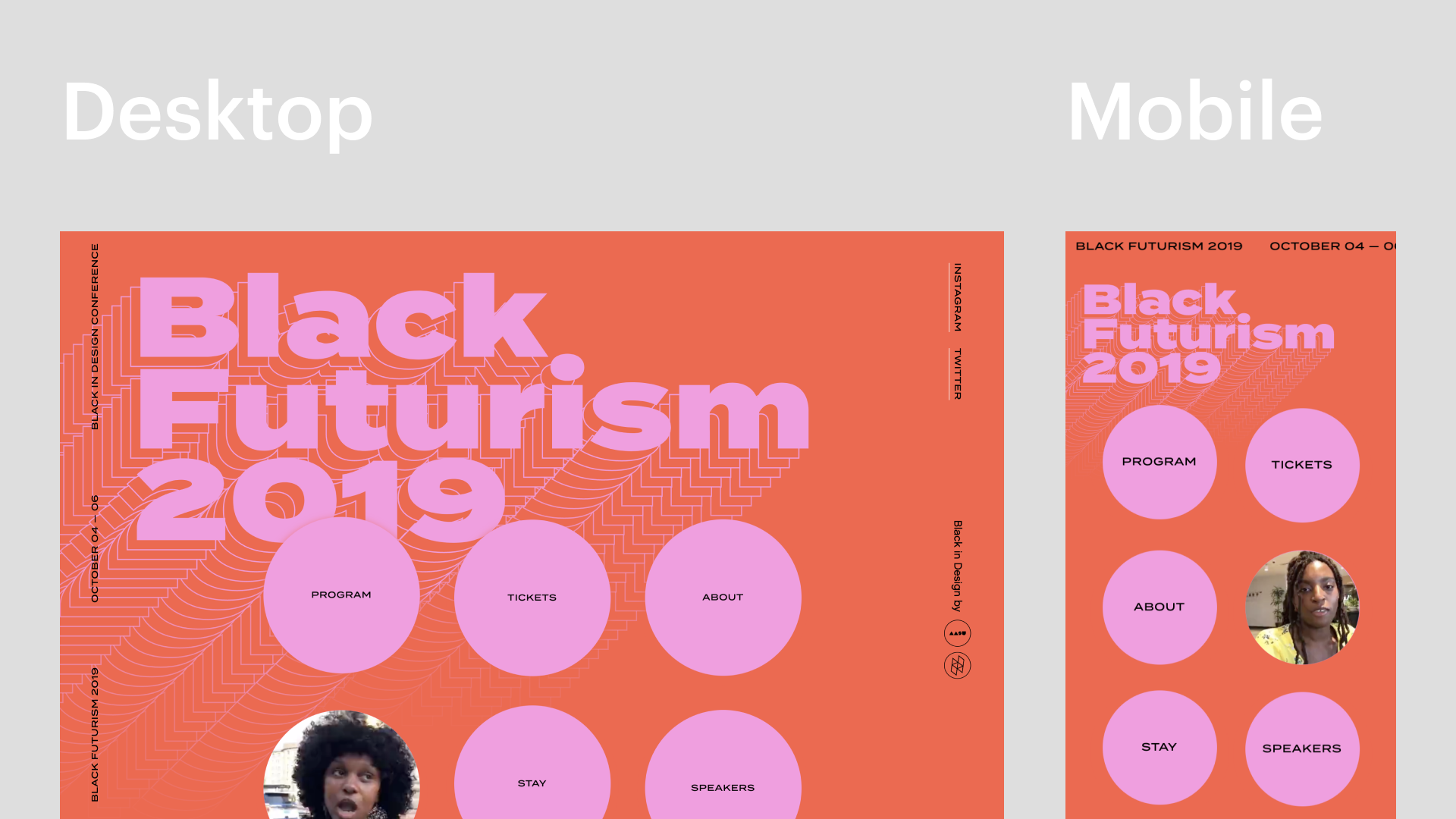
This merging of graphic design, interaction design, and new development practices has created a New Web. This New Web is rooted in the principles of design and comes to life through the collaboration of contemporary development practices. In fact, a savvy designer can create a New Website using a tool like Webflow which incorporates design and development into one seamless tool.
The key to creating a New Website is to get developers in on the conversation as early as possible. Showing them the thinking behind a design, and being open to modifying as needed can be the difference between a static site or a great brand expression. The more frequent these conversations happen, the more opportunities there are for collaboration. On the other side of the coin, developers who are open to non-traditional designs and to learning new technologies can be the turning point in making a great site.
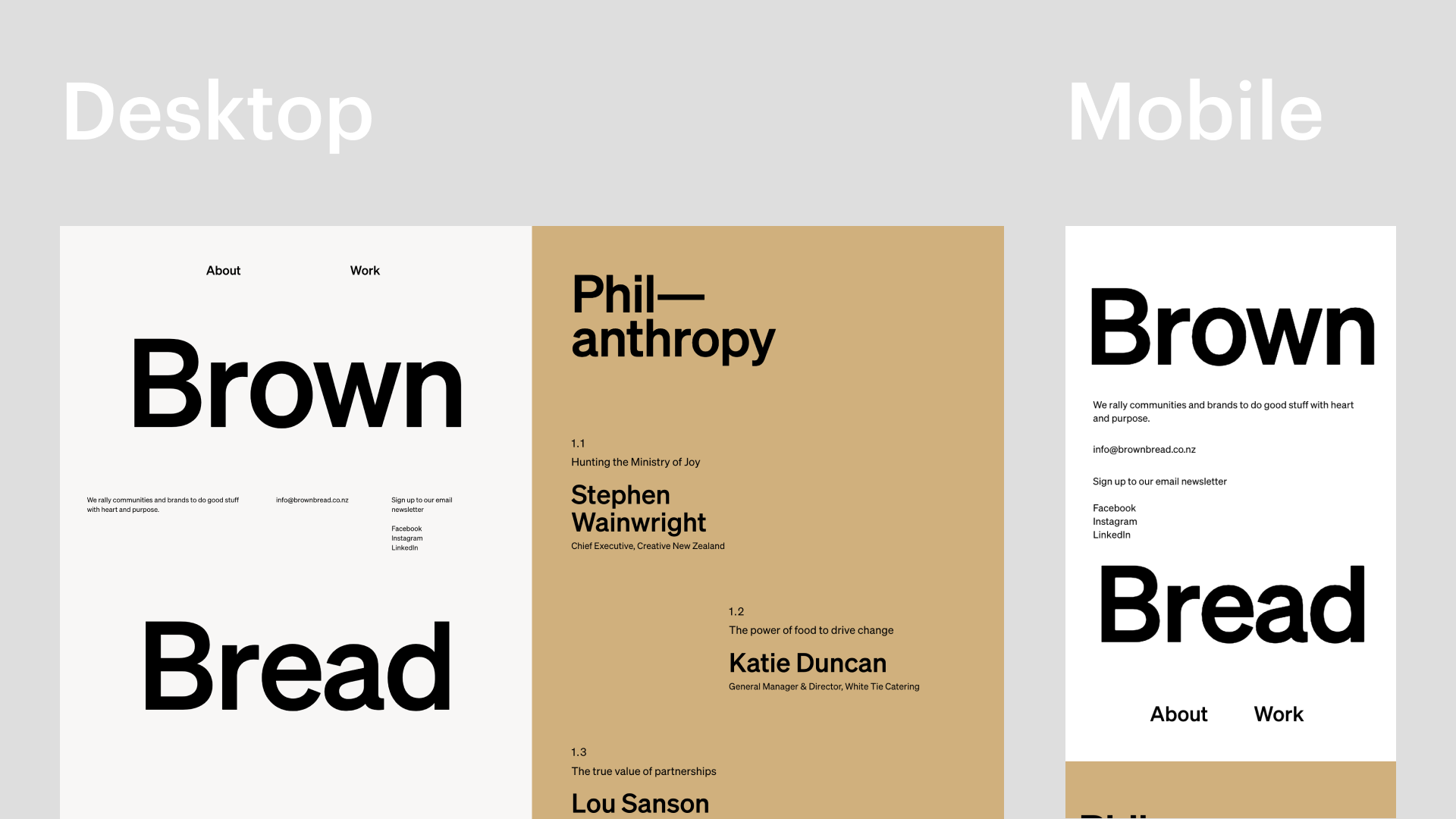
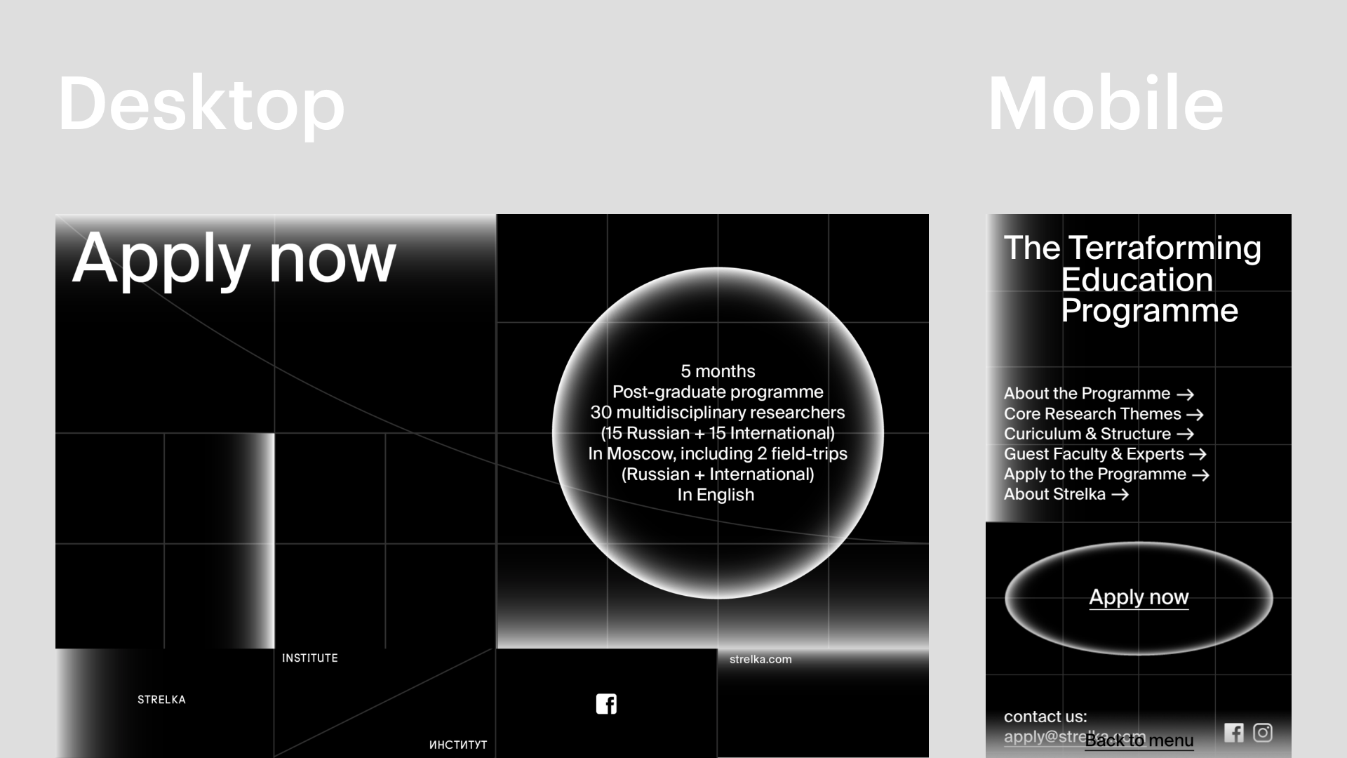
New Web can be as avante-garde as you can imagine. No forms are off-limits, as long as you spend the time designing a mobile experience that achieves the same goal as your desktop design. This allows for more specific and greater brand expression. A New Website creates a custom experience for a brand that stands out from the pack as memorable and clever. This also allows for cohesion between web, print, event, and motion in a brand system.
There is no excuse for an average-looking site today. For many companies, your website is your lifeblood. It’s the first point of contact, a funnel for sales, a magnet for attracting top talent, and a vehicle for radical creative expression. There have never been better resources for building than right now—and that’s because the people who spend their days making websites are the ones actually making the tools. Both designers and developers must continue pushing the boundaries to take the New Web into uncharted territories.
Emotive Brand is a brand strategy and design agency in Oakland, California.


Its very good