Helping devs “get ship done.”
Creating a slick, digitally-rich website made for developers, by developers
Services
- Content Strategy
- Copywriting
- Site Mapping
- Website Design
- Visual Design
- Back End Assistance
Every developer on the planet can benefit from releasing their code quickly and securely. But until Harness came along, they had to rely upon custom scripts and manual processes.
In 2017, we helped Harness come out of stealth with a visual identity to articulate its vision of Continuous Delivery-as-a-Service. Since then, it’s become one of the fastest growing DevOps companies of all time.
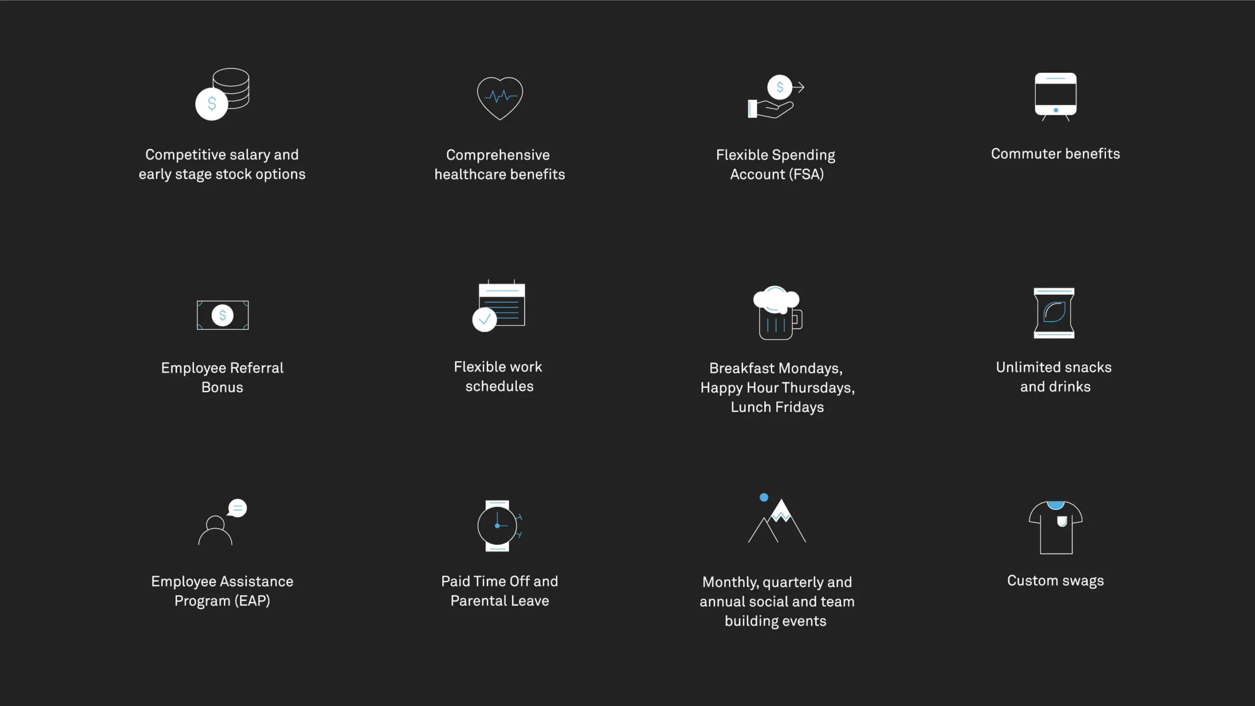
And as with any company experiencing hyper-growth comes growing pains. From content creep and messaging architecture to attracting and retaining top talent, Harness needed a serious digital refresh to maintain its incredible momentum.
Our goal was to build a website reflective of an iconic brand, blurring the line between open-source and commercial tools. Developers should see themselves—and then immediately email their CEO and say, “We need this.”
What We Learned Along the Way
Nothing sells itself.
In the tech world, there’s a misconception that aesthetics are low priority. If the product works like it’s supposed to, it will sell itself. Yet in an incredibly crowded ecosystem, no brand can afford to forgo creating a compelling brand story and visual identity.
Be clever, not cliché.
Many brands seek to adopt a brand voice that is clever, irreverent, or cheeky. Yet, if you draw your personality from clichés or tired internet slang, you’ll end up sounding like everybody else. The key is to develop a voice that is clever, but not cloying.
Empower your audience.
We often hear, “How do we attract more x to our site?” The answer is always the same. If you’re looking to bring in a certain audience, make them the hero. Build a site that offers them real value in a language they understand.
Tracy Lloyd, Chief Strategy Officer, Emotive BrandHarness understood the importance of investing in their brand early on—even while they were operating in “stealth mode.” When it comes to solidifying your brand, there’s no such thing as too early.”
Scientifically Engineered to Delight
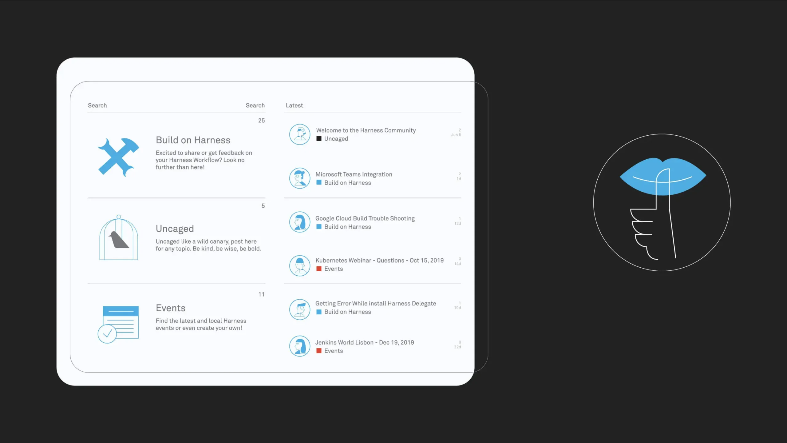
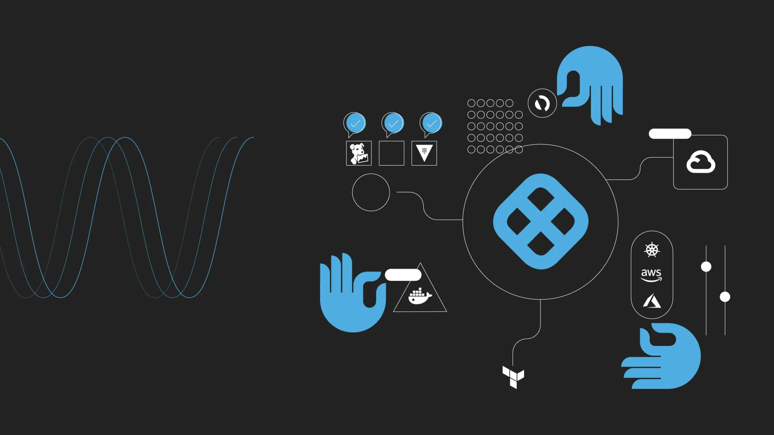
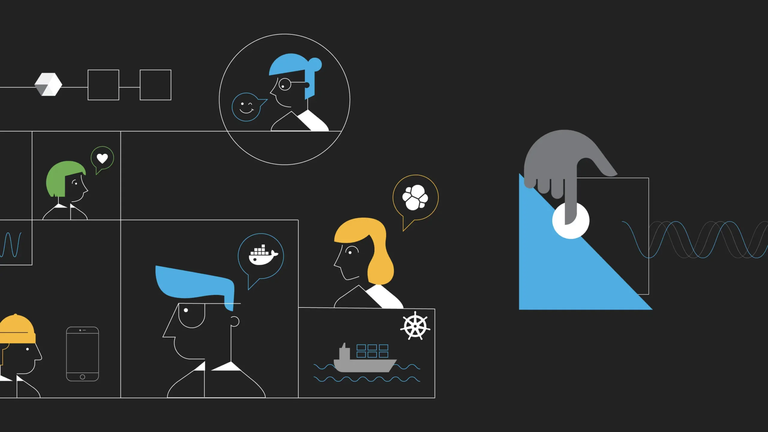
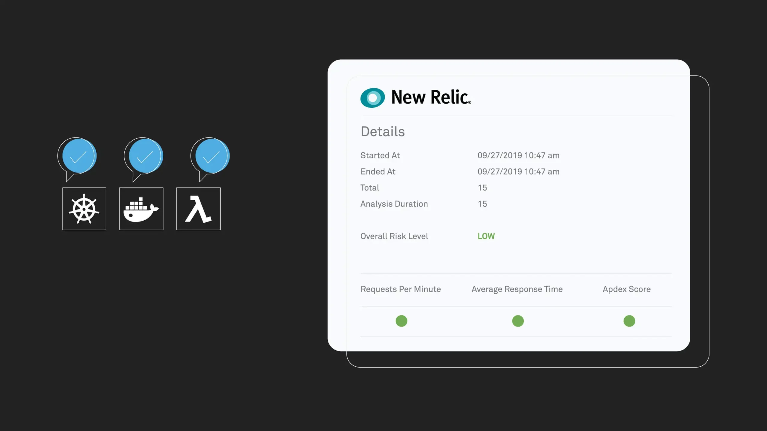
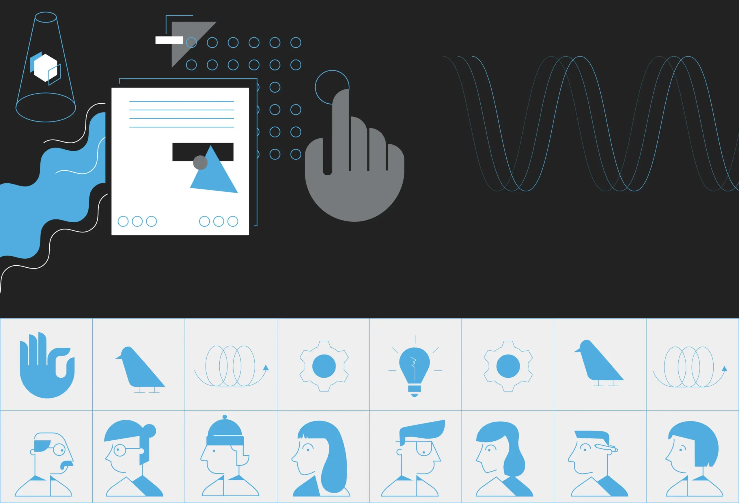
As an audience, developers are not one-size-fits-all. Harness needed a visual language that was scientific and precise—but also maintained their cheeky sense of humor. We developed a library of illustrations that mirrored the technical nature of their products, while still being light-hearted enough to embody the delight of “getting ship done.”
A Continuous Design for Continuous Delivery
Harness’ technology is complex, but at its heart, it’s about removing friction and making things run as smoothly as possible. As such, we needed design that felt technical, but never overwhelming or bogged down. Every infographic and schematic should effortlessly flow into the next, always leaving enough room to breathe.
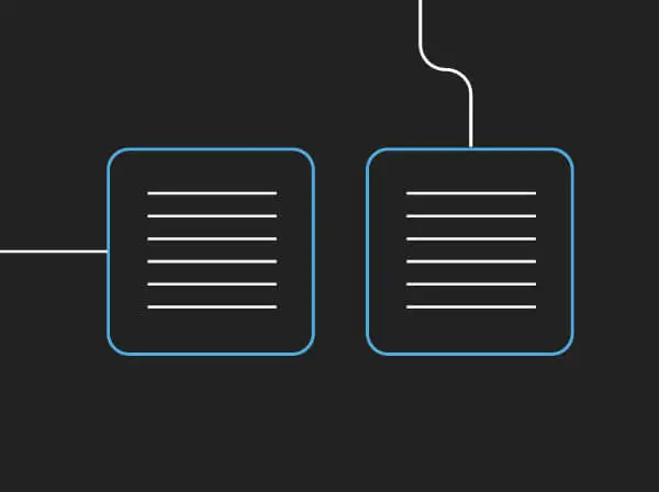
Start with structure.
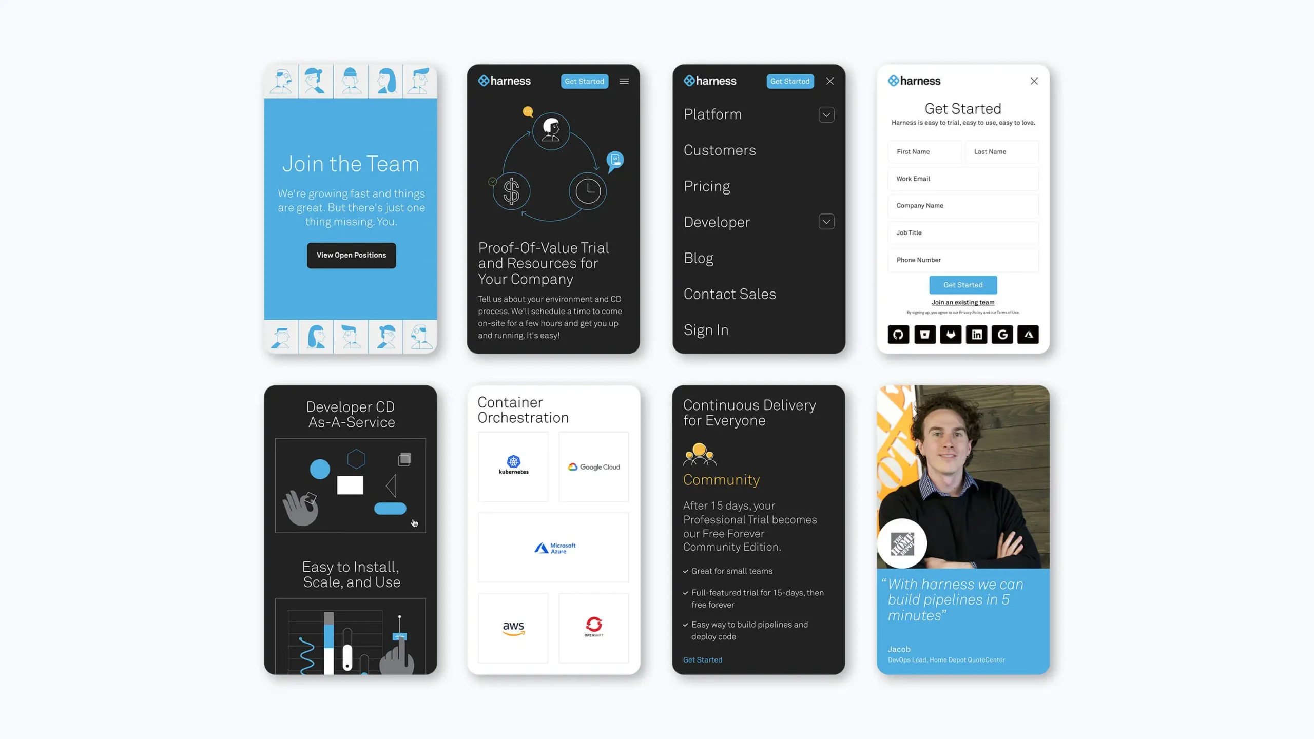
For this project, we needed to translate our work across more than 30 web pages. Thus, we needed to define the patterns and modules early on, so we could design, write, and code efficiently.
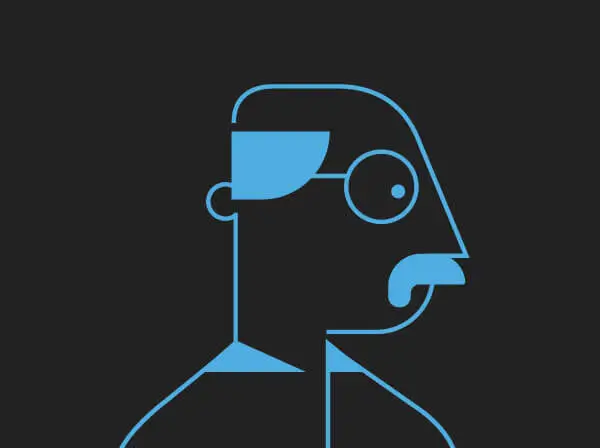
Keep your subject-matter experts close.
Given the complex nature of continuous delivery, we needed to validate each and every graphic representation with the client to ensure it accurately described the nature of the system.
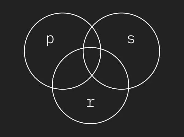
Design to your tech stack.
Knowing we were using lottie.js—which has a limited feature set—we directed around these constraints to ensure the artwork and animation style matched up in perfect harmony.
Shoot straight.
Unfortunately, developers are used to corporate speak from out-of-touch enterprises. We pivoted away from that and made Harness into a brand that speaks dev’s language—not bs.
Recent Work

Bringing a people-centered brand into a digital-first, product-led future.
View case study


