Brand Identity, typography, typeface… it’s all part of your brand and its story
A brand identity is critical to get right. A typeface helps shape the stories a brand tells. It sets the tone of a brand. Typography is in many ways the first impression and introduction to your audience. According to Sarah Hyndman, “Typography is like the clothes a person wears; it tells the world who they are and who they want to be.”
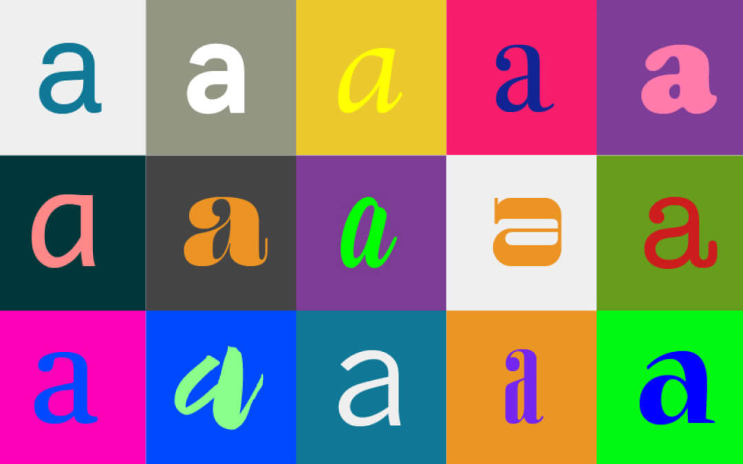
Typography, in other words, is one of the most important aspects of your brand.
A few things to consider when selecting a typeface for your brand:
Align with brand strategy
A typeface should reflect what your brand stands for: your brand’s personality and promise. The more a typeface aligns with the brand strategy, the clearer and stronger the message becomes.
Typography sets the tone and voice of a brand. The use of bold vs. light type weights or serif vs. sans serif fonts can radically affect the way a brand message is perceived. For example, Google’s recent brand redesign of their logotype – from a serif typeface to a san-serif typeface – helped align the brand with an even more forward-looking vision. This shift refreshed Google’s brand image and helped the company transition from looking like a start-up to a modern tech company with cutting-edge technology, while still maintaining its whimsical personality.
Keep it consistent
The more consistent the application of typography is across applications, including digital and printed materials, the more recognizable and approachable a brand becomes. By using consistent weights and relative point sizes for headers, sub-headers, and body copy across all brand messaging, a brand develops a strong visual language that becomes ownable. Brands often stray from this consistency when developing applications independently. The overall ecosystem of the brand should always be considered when developing any application. Consistent use of the brand’s typeface will help the audience connect quicker with the brand and help the brand stand out from competitors.
Make it versatile
In today’s world of constantly evolving technologies, a typeface’s adaptability is important. Digital screens have created the need for a wider range of flexibility within a typeface. A typeface should be appropriate for both large and small scale print and digital materials, ranging from applications such as a large billboard down to a tiny smartwatch display.
Consistency of use within a typeface is key to developing a brand’s personality, but different type weights and sizes can be adjusted to best suit the application. For example, a thin weight might work well on a large printed poster, but is unreadable on the web. Selecting a typeface with a variety of weights will allow for flexibility, while producing a range of applications. It’s also important to consider a brand’s growth and trajectory when selecting a typeface. Make sure that the typeface can support not only the brand’s current applications, but also the applications of the future.
Make it feel right
In the same way that a typeface can elevate a brand, the wrong typeface can also damage a brand. The wrong typeface can sever consumers’ emotional connection to a brand, creating feelings of confusion, mistrust, or even betrayal. For example, consider Tropicana’s 2009 brand and packaging redesign. Tropicana’s brand was known for being friendly, approachable, and a sense of nostalgia. But the redesign showcased a generic san-serif logotype that lost the brand’s human and approachable attributes. Although the logotype and packaging were well designed, it did not match Tropicana’s brand personality. According to Business Insider, Tropicana lost 20% in sales due to their redesign. Customers lost their emotional attachment and loyalty to the brand.
Because typography plays a crucial role in how people identify with a brand, taking the time to examine all aspects of how a typeface aligns with brand strategy is critical. Because typefaces are easily accessible today, it can be easy – too easy! – to select one quickly without taking careful consideration of how it affects your brand. There’s no use putting effort towards building a brand if you don’t choose the right typeface to support the brand.


